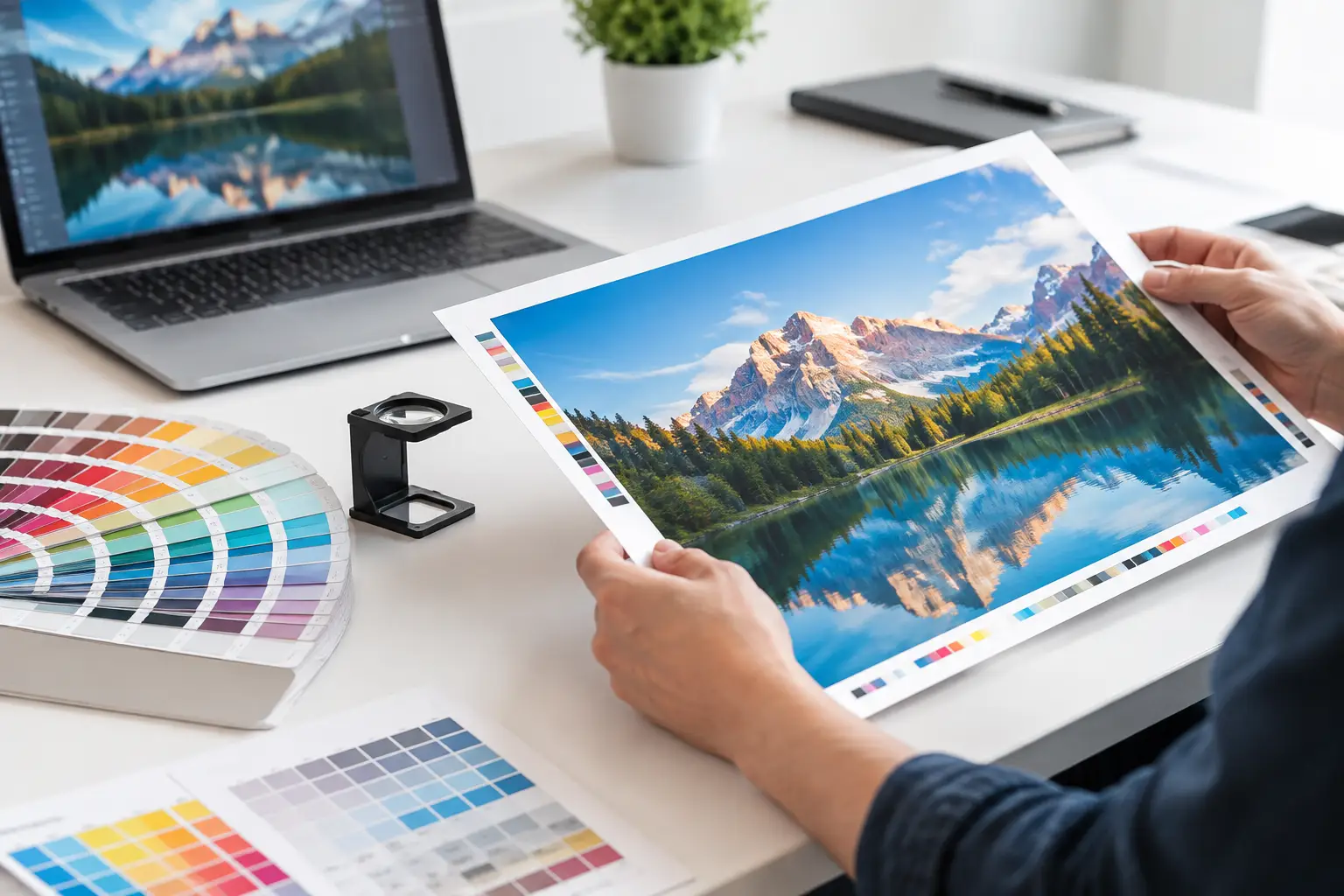
A brochure can look excellent on screen and still print with a white edge, blurry photo, shifted logo, or an offer too close to the trim line. Taking time to prepare artwork for printing protects your budget, your schedule, and the professional image your business puts in front of customers. Whether you are ordering business cards, postcards, banners, yard signs, or a direct-mail campaign, a print-ready file helps production move forward without preventable revisions.
Start With the Finished Product Size
Build your artwork at the final trim size your customer will hold or see. A standard postcard may be 4 x 6 inches, while a folded brochure, door hanger, envelope, or banner has its own finished dimensions. Starting at the right size prevents distorted graphics, unexpected scaling, and copy that feels crowded after production.
Before designing, confirm the product size, orientation, stock, folding method, and quantity. A tri-fold brochure needs panels planned for the fold, not simply three identical columns. A banner needs larger type and stronger contrast because it will be read from a distance. A vehicle decal may require a different file approach than a business card because installation, surface shape, and viewing distance all matter.
For direct-mail pieces, size affects more than appearance. It can affect postage, mailing format, and the room available for an address, postal indicia, and mail-processing marks. Plan the format before you spend time polishing a design that may need to be rebuilt.
Add Bleed and Keep Important Elements Safe
Commercial printing involves trimming stacks of paper. Even with accurate equipment, trimming has a small tolerance. Bleed gives the cutter extra printed area beyond the final edge, so a background color, photograph, or pattern reaches the edge cleanly instead of leaving a thin white line.
A common bleed allowance is 0.125 inch on every side, but specifications can vary by product and press. If your finished postcard is 4 x 6 inches and its design has full-color imagery to the edge, the file is typically built at 4.25 x 6.25 inches. Extend the background through the bleed area. Do not just add a blank border around the design.
At the same time, keep logos, headlines, phone numbers, QR codes, and other essential elements inside a safety margin. A practical starting point is at least 0.125 to 0.25 inch from the trim line, depending on the item. Folded pieces, perforated forms, and door hangers need additional space around folds, holes, and perforations.
This is one of the most common places where a screen preview can be misleading. The line shown in your design program may look precise, but the printed piece is a physical object with trim and handling tolerances. Give important information room to breathe.
Use Images That Will Hold Up on Press
A large image copied from a website or social media post often looks acceptable on a monitor but becomes soft or pixelated in print. For most printed marketing pieces, aim for images that are 300 ppi at their final placed size. Resolution must be evaluated at the size the image will print, not at the size of the original file.
For example, a photo that is 300 pixels wide cannot produce a sharp 6-inch-wide printed image at 300 ppi. Stretching it larger in a design program does not create detail that was not there. Find the original high-resolution image, purchase appropriate licensed photography, or use a different visual.
Logos, line art, and simple illustrations are best supplied as vector artwork whenever possible. Vector formats preserve clean edges when scaled, which is especially useful for signs, decals, banners, and branded stationery. Avoid screenshots of logos, compressed images pulled from email, and files that have been repeatedly saved as low-quality JPEGs.
Set Color Expectations Before You Print
Screens use RGB light, while most commercial printing uses CMYK inks or digital color processes. Bright blues, neon greens, and intensely saturated colors may not reproduce exactly as they appear on a backlit monitor. Convert artwork to CMYK when requested, but do not assume every RGB file will convert identically. The right workflow depends on the press, paper, and intended result.
Brand colors deserve special attention. If color consistency is central to your identity, provide approved color values and ask about the best production method. Some jobs benefit from Pantone spot colors, while others are more cost-effective in standard full-color process printing. The choice depends on quantity, budget, material, and how critical a precise brand match is.
For black text, use solid black rather than a four-color black build. Small type made from multiple ink colors can appear less crisp if the colors do not register perfectly. Large black backgrounds are a different case and may require a richer build for deeper coverage. A print professional can recommend the right settings for the piece you are producing.
Check Fonts, Copy, and Small Details
Spelling errors and incorrect contact information are expensive because they can turn an otherwise successful print run into waste. Review every headline, offer date, website address, phone number, suite number, and call to action before approval. Read the file at 100 percent, then ask someone unfamiliar with the project to review it as well. Fresh eyes find mistakes that the designer may overlook.
Use readable type sizes for the audience and the way the piece will be used. Fine print may fit on a postcard, but that does not mean customers can comfortably read it. On banners and yard signs, prioritize a short message, high contrast, and a clear phone number or web address. On invoices and forms, legibility and organized fields matter more than decorative design.
Make sure fonts are embedded in the final PDF or converted to outlines when appropriate. This prevents font substitution if the production team does not have the typeface installed. Keep an editable source file separately for future updates. The press-ready PDF should be the controlled version approved for production.
Prepare Artwork for Printing as a Production File
A high-resolution PDF is the preferred final format for many commercial print jobs because it keeps layout, fonts, and images together. Export using the requested PDF preset and include bleed when the design runs to the edge. Crop marks are useful only when requested. Unnecessary marks can create confusion or reduce available space on certain products.
Before sending the file, inspect the exported PDF instead of assuming it matches the working file. Check page count, page order, final size, bleed, image sharpness, and whether any text reflowed. Open it at full size and zoom into critical areas such as fine type, logos, QR codes, and borders.
If you are sending an editable file rather than a production PDF, include all linked images and fonts or package the project from your design software. Missing links are a frequent reason a file does not output as expected. Name files clearly with the project, version, and date so everyone knows which artwork is current.
Plan Direct Mail Space From the Beginning
A direct-mail postcard is both an advertisement and a postal piece. Reserve a clear mailing area on the address side before finalizing the design. Decorative patterns, heavy color, and small text can interfere with addressing or postal requirements when placed in the wrong location.
Your campaign may also need room for a permit imprint, return address, barcode, or variable recipient information. The exact setup depends on the mailing method and list strategy. If you are targeting local households, promoting an event, or sending offers to a selected customer list, coordinate artwork and mailing details early rather than treating mailing as an afterthought.
This is where working with one print-and-mail provider can save meaningful time. JR’S Handling can help businesses coordinate the print piece, mailing-list needs, bulk-mail preparation, and distribution so the campaign is built for the real production process, not just the screen preview.
Request a Proof When the Job Calls for It
Proofing is your final opportunity to catch a problem before a full run goes to press. A digital proof confirms content, layout, and general positioning. A hard-copy proof can be especially valuable when color, paper feel, finishing, or fine detail will affect the result.
Not every job needs the same level of proofing. A simple reorder of an established invoice may move quickly, while a new high-value postcard campaign or customer-facing brochure deserves a more careful review. Consider the cost of the run, the visibility of the piece, and the consequences of an error.
Bring the goal of the piece into every decision. A printed item does not have to be complicated to perform well. It needs clear information, clean production, and a message customers can act on. When you have a new project in mind, provide the intended size, quantity, deadline, and distribution plan early so your printer can help turn your artwork into marketing that is ready to work for your business.